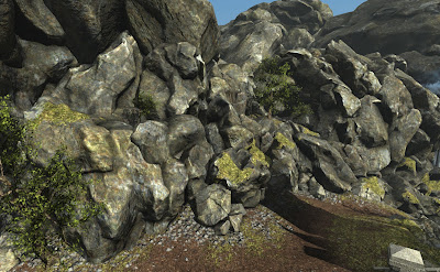
- reducing the number of normal map details
- using a subtler diffuse texture with fewer details
- enhancing the strength of the asset-specific curvaturecavity/occlusion
- bringing the overall tonal balance between lit and unlit closer together
- swapping out overlay blends for multiplies
- removing the "texture rotates with asset rotation" stuff (since the textures were now rotation independent)
- simplifying the top-down lighting stuff
Before:
After:
You may also spot I've been toying with grassy/mossy decals. Still playing with those, I don't expect to leave them as-is.


No comments:
Post a Comment